METRO DIRECTION
Rebranding, logo design, banner design, stationary and presentation template.
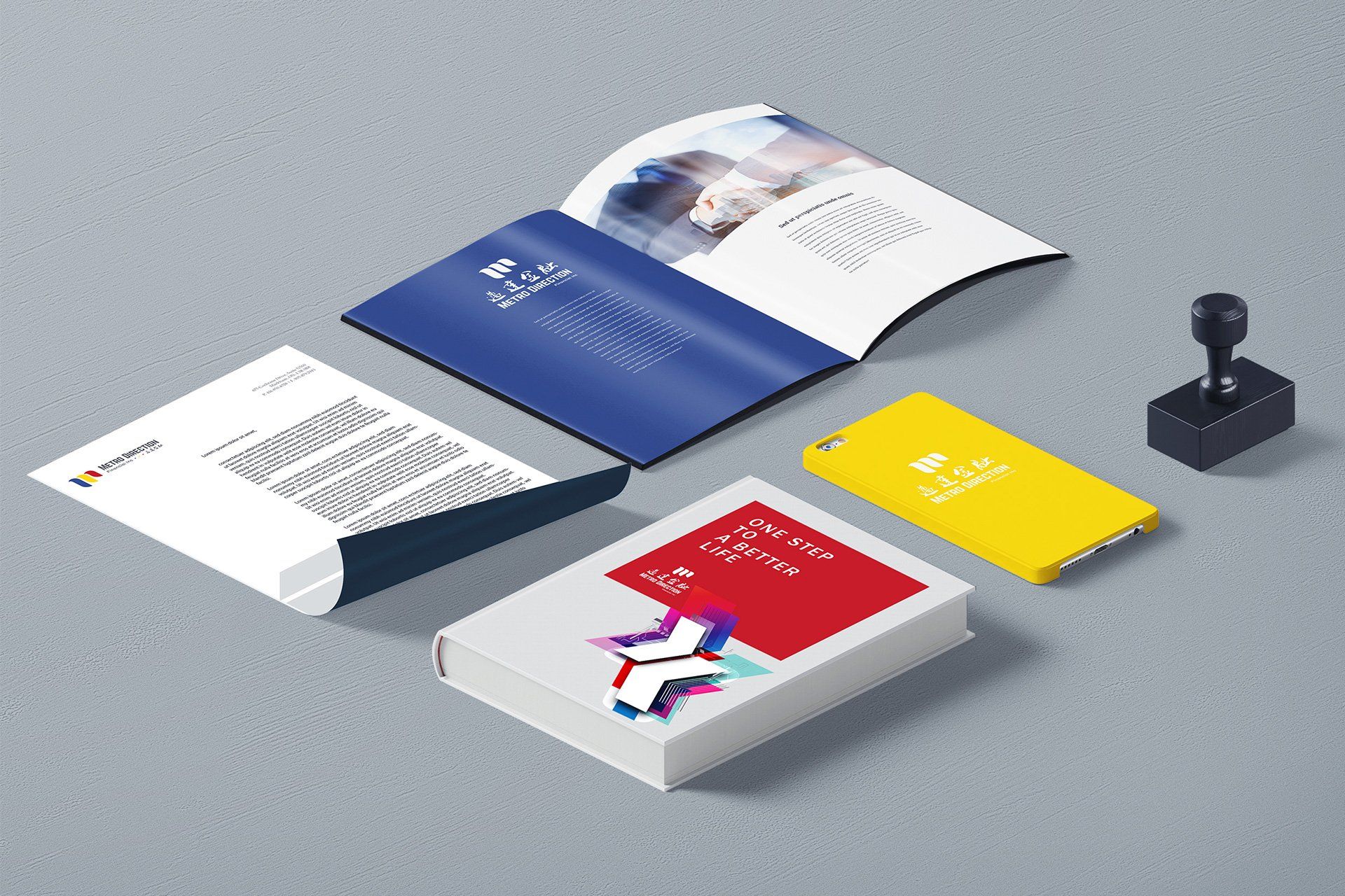
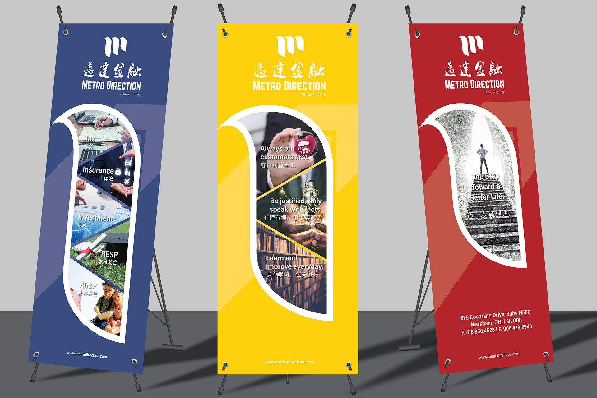
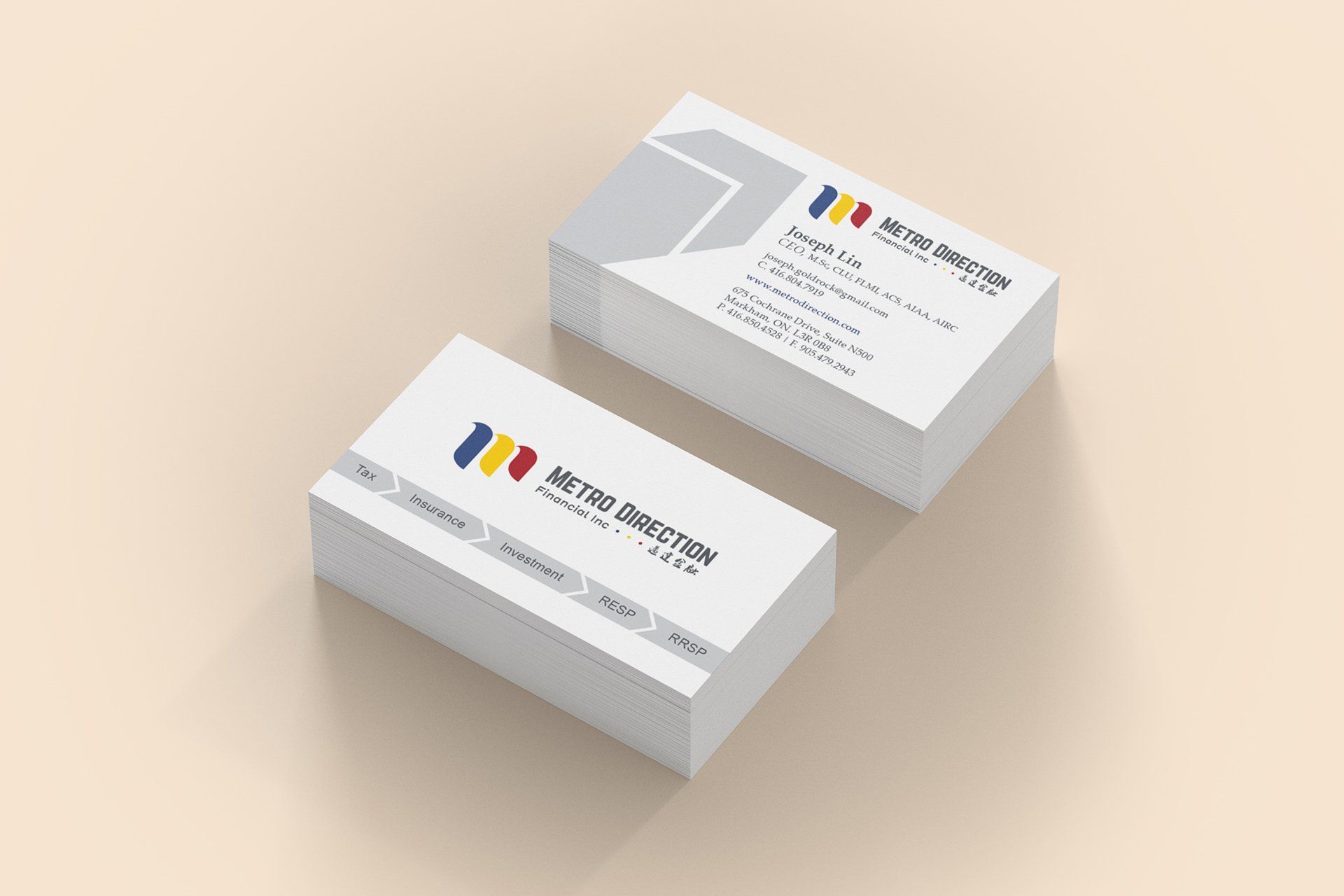
Metro Direction
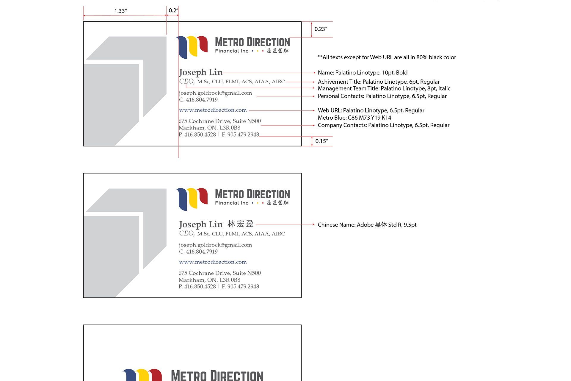
This is a rebranding project which leads to a more modern and professional look. Three primary colors were chosen to represent three key founders of the company. The three flags were conceptualized and simplified to create a minimal design. For the pull-up banners, I separated them into three panels and used large color coverage so the banners are much more noticeable. I've also created branded stationary and PowerPoint templates. as well as guidelines for printer to follow.